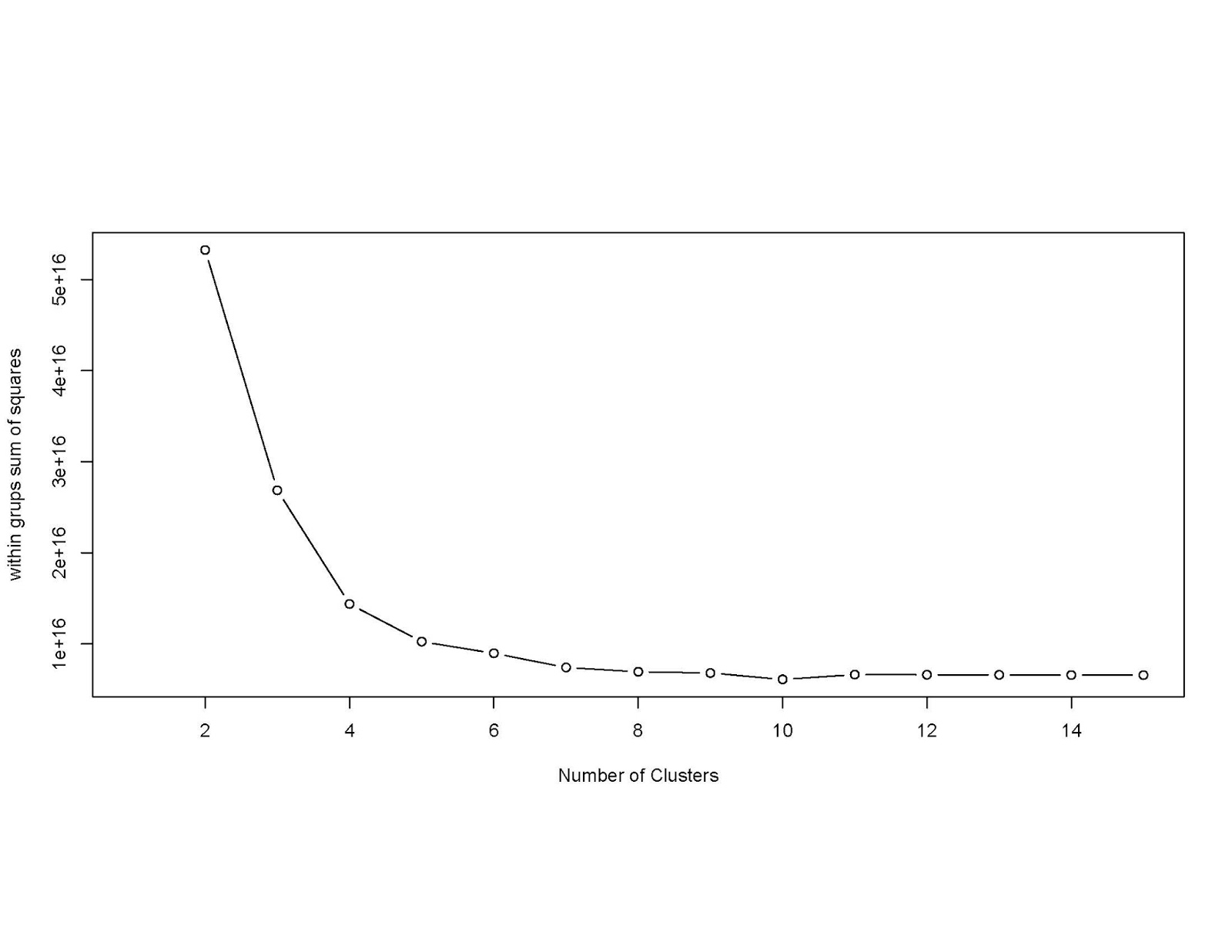
Using the dataset given at this site, I converted the *.xls file into a *.csv file and read it into "R". Are there any common characteristics to the statistics for all these stations over various years? First let us see if there are any clusters. Using R code, I got the following graphs(s): Looking at the curve, I was told that the ideal number of clusters may be at the location where on point is out of line with the rest. This appears to be around 5 clusters. Incidentally, the data set for ridership includes total for the year and average weekday and weekend ridership. Note that during weekends, many lines may be closed and replaced by bus services. In the cluster dendrogram below, there appears to be only two clusters: One cluster for total annual ridership figures (2008 -2016) and average weekday and weekend ridership for the same years. The clusters were made obviously on the difference of annual and average weekday and weekend data. This this experiment was a failure. The output below shows the proposed clusters. I will try to figure this out in the future